Spacial Arrangement
User interfaces usually follow a consistent spacial arrangement that combines form, function and aesthetics. These spacial arrangements are similar to those you would find in a newspaper or magazine. The purpose in the arrangement it to logically layout the text while drawing the readers attention to important content. At the same time the layout should have a simple aesthetic form with a consistent use of color and font style in order that the reader is not distracted or confused. This page describes some common spacial arrangements. These arrangements can often be simulated by a table with some merged cells. This is because it easy for the human eye to scan items in arranged rows and columns. This may suggest that a table based layout would be appropriate for designing a user interface. However, there are occasions when the developer does not want to be restricted to table layout regime.
Rapid Layout .NET lets developers create spacial arrangements by using of horizontal and vertical guides. However, the developer can still freely place controls anywhere on the form and can choose whether or not to make connections to the guides. In addition Rapid Layout is flexible enough to allow further layouts within cells without having to add nested panels.
Web Page Arrangements
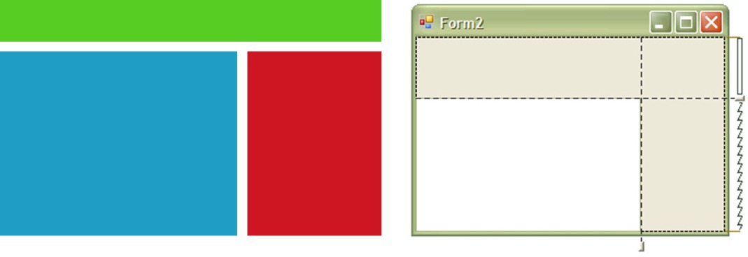
This layout shows a title area, a main web page area on the left with a navigation pane on the right.
News Layout
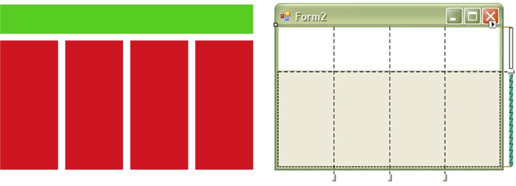
This is another type of layout that can be used on web pages which shows a title page and several columns typical of a newspaper or news site.

IDE Arrangements
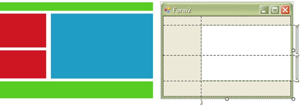
This layout is common for integrated development environments. At the top is the menu and tool strip. On the bottom is the message windows. On the right is the editing window. On the left there is the file browser and the code navigator.

Outlook Arrangement
The default arrangement of Microsoft outlook has the menu and tool strip at the top. At the left is the list of folders and tasks. In the middle there is the list of e-mail headers. On the right is the viewing pane. Rapid Layout has the added ability to set the flexibility of the the springs between the guides. In this example the viewing pane is more flexible than the other panes so is larger. However all panes will grow/shrink proportionally when the form is resized.

One Note Arrangement
This shows the arrangement of Microsoft OneNote. Again there is a menu and tool strip at the top. On the right hand side is a navigation pane. Then within each note is a header and an editing pane.

| Home / Features / Spacial Arrangement / |
